
Two weeks ago you measured the afterglow of the big bang which appears now as a nearly uniform microwave glow all over the sky which we call the Cosmic Microwave Background or CMB. Last week you investigated ideas about curved space the geometry of an expanding universe. In this lab we will bring these ideas together to actually determine the curvature of the universe in which we live.
Although the CMB is nearly uniform it turns out it is not exactly so. It took many years until scientists could build instruments sensitive enough to detect the slight unevenness of the microwave glow and unfortunately it is not possible for us to do it in the lab. Instead we will use a map made by a recent experiment and try to understand how this map can tell us about the curvature of space.
The CMB is light which comes to us from the "surface of the cosmic fireball". This light has been traveling through space in straight lines ever since the Universe was 380,000 years old. The Universe is now about 13.8 billion years old. So this light comes to us from when the Universe was 1/30,000th of it's present age.
Early on the Universe was super hot gas called plasma filled with blindingly bright light. Plasma is not transparent to light, so the light rays kept bouncing around having their directions changed - getting "scattered" around by the plasma. As the Universe expanded it cooled. 380,000 years after the beginning it had cooled enough that the plasma became ordinary gas. Ordinary gas is transparent to light so after this time the light rays traveled in straight lines. So we call the time 380,000 years after the beginning "last scattering".
The present day Universe is very "lumpy" - the density of matter in the Earth or a star is enormously greater than the density of the wispy gas in the great voids in between the galaxies. But the plasma of the early Universe was extremely smooth - the densest clumps were only slightly more dense than the least dense regions in between. Nevertheless the lumps were slightly hotter and the regions in between slightly cooler.
The hotter regions emitted slightly more light than the cooler regions. This leads to an amazing fact: when we measure the brightness pattern of the CMB over the sky we are actually measuring the density of the Universe on a spherical shell around where Earth is now as it was 380,000 years after the big bang - a kind of "core sample" from a very early time. There are CMB light rays all through the Universe. But the ones arriving at Earth today from all directions are the ones which set out from a spherical shell around Earth 13.8 billion years ago.
Since last scattering the Universe has continued to cool and expand - by about a factor of 1000. The hot gas went on to form much denser clumps called galaxies, and eventually stars and planets and us. The blinding white light rays have meanwhile being streaming along unimpeded, as space stretched under them shifting them way down in the microwave region of the spectrum. Currently the best CMB telescope ever built is a spacecraft called WMAP which is operating right now. The red regions are slightly hotter and the blue regions slightly colder. Imagine that Earth is at the center of this sphere - we are seeing the clumps and anti-clumps on a shell cut through the 3D structure of the Universe when it was 30,0000 times younger than it is now. Which is pretty amazing information to be able to have when you think about it.
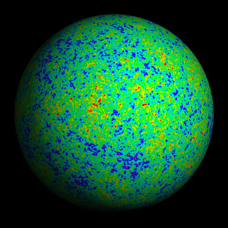
Look at the map above. Looks like a bit of a mess doesn't it? That's because the infant Universe was very unstructured and chaotic. There are blobs of all different sizes. Nevertheless it is pretty clear that there is a size of blob which is most common.
In the primordial plasma a region which found itself a bit denser than the areas around it would start to collapse in on itself due to its own self-gravity. The size of the collapsed regions grew over time as the pressure wave (sound wave) moved out from the center. i.e. as material has time to "realize" that there was a clump nearby and start to fall towards it. But then suddenly the Universe cooled enough to become neutral gas and the light rays became "detached". It's easy to see why the most common size of blobs and anti-blobs (hot and cold regions) corresponds to the distance sound had had time to travel in 380,000 years. We call this distance the "sound horizon".
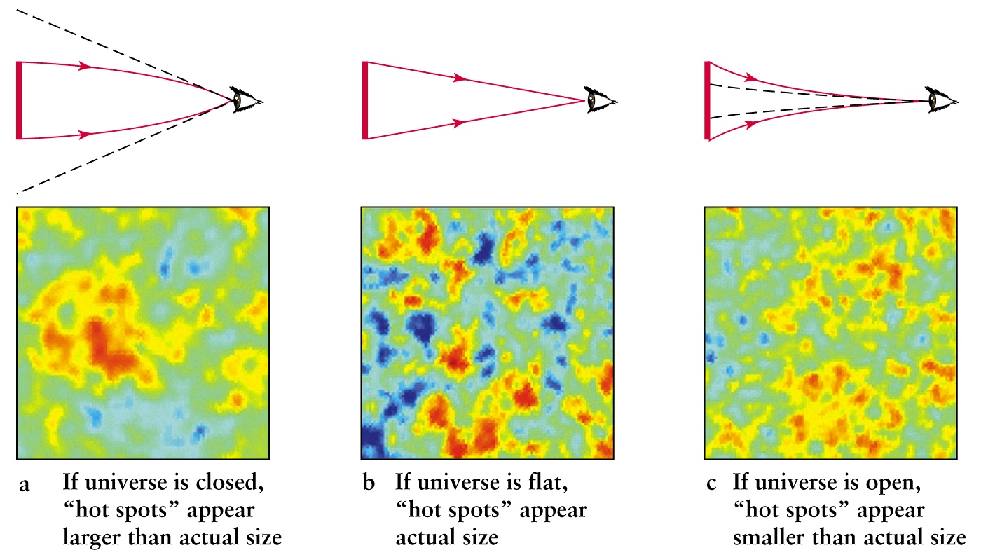
What we actually measure on the CMB sky is the angular size of the blobs - i.e. the blob size in degrees. But the sound horizon is a physical size - in light years. We can exploit this to measure the curvature of the intervening space. In the figure below the solid red bar to left in each case represents a typical hot or cold blob. The thin red lines with arrows are the paths that light from the edges of the blob takes to reach the observer at the right in each case. The middle possibility is where space is "flat". i.e. it behaves like a flat piece of paper, a triangle is a triangle, and the blob subtends the angle one would normally expect given its size and distance from us. The small maps at the bottom of the figure show how a small region of the CMB sky might look in each case.
Now draw your own triangle assuming that space is flat. From the discussion above:
Now think again - there is a wrinkle here - we want to draw this imaginary triangle as it would "look today" since that is where we are viewing from. So we have to take into account that the Universe has expanded by a factor of 1000 since the CMB light rays started on their long journey to us. Draw the triangle again accounting for this fact.
This is a very simplified calculation but the answer is not so far from correct.
Now we are going to compare an actual map of the CMB with results from detailed calculations. Note that the calculations - your simple one, or detailed professional ones - just tell us how many blobs of given size to expect - the "quality" of the pattern. They do not tell us what actual patten we will see - that is random.
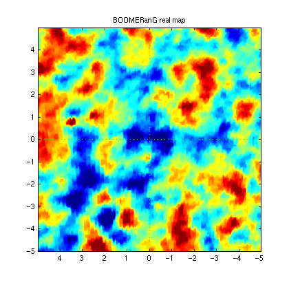
Here is the real map - it is taken from an experiment called BOOMERanG. Is is just a zoom in on a small patch of the big map above.
Click on the image below to see the simulated maps closer up. To aid the comparison you probably want to open this in another browser window. Right click in the image and select "open link in new window".
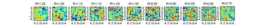
When making the comparison again note that we are only expecting the quality of the maps to be similar - their "blobiness" - we are not looking for maps which actually have the same structure. Also note that good though the telescopes are they are not perfect - the real map contains noise and other imperfections which the simulations do not. The number "Omega" above each map is the curvature factor assumed in each simulation - one corresponds to flat space, numbers greater than one to closed space, and numbers less than one to open space.
If you want to read more about this stuff Wayne Hu's website is really good.